Introduction
Graphic design is both an art and a science through which messages and information are communicated to the audience using visual elements. This field merges artistic creativity with modern technology and plays a vital role in today’s world of communication, advertising, and branding. Everywhere we encounter an image, logo, poster, website, or user interface, we witness the impact of graphic design.
This comprehensive article delves into various dimensions of graphic design. Topics such as the history of graphic design, principles of aesthetics, professional design software, techniques for logo and visual identity creation, user interface design, typography and color theory, advertising design, and many other related subjects will be thoroughly explored. The goal is to provide both general enthusiasts and professional designers with a deep and practical understanding of the vast world of graphic design.
Proper use of graphic design principles can significantly enhance the quality of the final work, the effectiveness of the message, and the visual appeal of the outcome. Therefore, join us as we step by step explore the essential concepts and key principles of graphic design, and advance your skills and knowledge in this dynamic field.
The History of Graphic Design
Graphic design has always played an important role in human visual communication throughout history. Even in prehistoric times, humans used painting and visual symbols to convey messages and tell stories. Cave paintings and the hieroglyphs of ancient Egypt are examples of this early form of communication, showing that the basic principles of design were recognized by people of that era. In Iranian culture, calligraphy and Islamic decorations represent the human ability to combine artistic forms and convey visual messages. These achievements laid the foundations for modern graphic design, and valuable ancient works have shaped the path of later graphic art and contemporary graphic designs.
The invention of the printing press in the 15th century by Johannes Gutenberg marked a turning point in the history of visual communication. This invention made mass production of books and images possible and gradually led to the development of printed graphics and commercial advertising. During the Industrial Revolution of the 19th century, the printing industry grew significantly, and the use of posters, greeting cards, business cards, and other printed media for promoting products and services became widespread. Additionally, with the improvement of lithography techniques, designers were able to create a variety of visually appealing effects that were used in print advertising. In fact, theater posters and the markets of that time showcased the creativity of designers in utilizing new colors and forms.
The early 20th century saw the emergence of significant artistic movements that had a profound impact on graphic design. The Art Nouveau movement, with its curved lines and organic patterns, created a decorative and striking style in poster and book design. Then, in the 1920s, the Bauhaus school in Germany laid the foundations for modern design by emphasizing the combination of art and industry and the use of simple geometric shapes. The principles of the Bauhaus school focused on simplicity, functionality, and the application of geometric forms in art. In the 1950s, the Swiss style, with its emphasis on systematic grid structures and minimalist design, became a global standard in graphic design. The Swiss style led to the arrangement of design elements with specific order in terms of size and spacing, enhancing the readability of printed texts.
With the expansion of computer technology in the 1980s and 1990s, a remarkable transformation occurred in the world of graphic design. Graphic software such as Adobe Photoshop and Illustrator entered the market, enabling the creation of complex designs and powerful photo editing capabilities. The 1990s also saw the rise of the internet; website design and online advertising became new areas of graphic art. In the 2000s and up to the present, with the advent of smartphones, social media, and digital media, digital graphics and interactive content have gained a prominent place in advertising and brand communications. Today, we see creative uses of graphics in mobile apps, videos, and various applications on a daily basis.
In Iran, graphic design has also undergone significant transformations. After the establishment of art schools and the recruitment of foreign professors in the 1940s, Iranian designers began creating works inspired by Iranian art. One of the pioneers in this field was Morteza Momayez, who, by combining traditional Iranian motifs with modern methods, created striking artistic posters. Gradually, with the growth of publishing and advertising in the 1960s and after the 1979 Revolution, the realm of posters and printed advertising expanded in Iran. The works of this generation served as a bridge between tradition and modernism, bringing a new visual identity to Iranian graphic art. These experiences, especially in the 1980s and 1990s, led to the development of educational institutions and the formation of a new generation of graphic designers.
Here is a summary of some key historical periods and events in graphic design:
The 1950s: The Swiss style and the promotion of minimal design using grids.
The 1980s: The emergence of graphic software and the digital revolution in design.
The 1990s: Web development and dynamic design; growing importance of graphical user interfaces and online advertising.
The 2000s to present: The dominance of digital graphics, social media, interactive graphic art, and the metaverse in modern communication.
Basic Concepts in Graphic Design
Graphic design is based on a proper understanding of visual elements and visual principles. Familiarity with these fundamental concepts helps the designer create effective and harmonious compositions. The following introduces the most important basic elements and principles in graphic design.
Some of the main elements of graphic design include:
- Point: The smallest visual element that can independently capture the viewer’s attention. A cluster of points can form a line, shape, or texture. In a design, a point can serve as an accent or focal element.
- Line: The simplest visual element that can indicate direction, movement, or the boundary between two areas. Lines can be horizontal, vertical, or diagonal, each conveying different feelings. For example, horizontal lines suggest calmness and stability, vertical lines imply strength and power, curved lines convey softness and dynamism, and jagged lines express energy and excitement. By directing lines, the designer can guide the viewer’s eye to key parts of the composition.
- Shape: Includes geometric and organic forms that give structure and form to a design. Geometric shapes convey order and precision, while organic shapes reflect creativity and freedom. Choosing the right shape effectively communicates the intended message or mood. For example, a circle symbolizes unity and wholeness, a triangle suggests stability and forward movement, and a square represents reliability and strength.
- Color: A powerful element that influences emotions, attention, and readability. Color combinations using harmonious palettes help emphasize certain areas of the design and create a strong visual identity. The intensity and brightness of colors affect the overall mood; vibrant colors attract attention, while soft and neutral tones convey calmness and elegance. Graphic designers can use color to send a specific message—for example, blue evokes trust and tranquility, red signifies excitement and energy, and green is associated with nature and freshness.
- Texture: Represents the surface quality of an image and adds depth and visual interest. Texture can be real or simulated in digital design. Using the right texture makes the design feel more tangible and visually layered. In digital design, textures are often simulated through image filters or patterned backgrounds.
- Negative Space: The empty space around or between elements that helps balance and improve the readability of a design. Smart use of negative space makes key elements stand out. A famous example is the FedEx logo, which uses the negative space between letters to form a hidden arrow. This technique adds a dual and creative dimension to the design, enhancing its aesthetic appeal.
On the other hand, the key principles of graphic design include the following:
- Balance: The even distribution of elements in space, either symmetrically or asymmetrically. Balance ensures the design doesn’t feel heavy and creates a sense of stability and harmony. In symmetrical balance, elements are mirrored on both sides of a central axis, like a floral design with mirrored sides. In asymmetrical balance, equilibrium is achieved through size, color, or placement—for example, a large element on the left balanced by several smaller elements on the right.
- Contrast: The difference between elements helps highlight focal points and improve readability. High contrast makes important parts of the design more visible—for instance, light text on a dark background or the use of complementary colors. Contrast can also apply to size, shape, and texture.
- Repetition and Rhythm: Repeated use of specific elements increases design unity and coherence. Rhythm results from regular repetition at specific intervals, creating a sense of movement and dynamism. This repetition builds visual consistency and leads the viewer’s eye through the design—e.g., repeating a color or shape throughout a brochure enhances cohesion.
- Visual Hierarchy: The arrangement and prioritization of elements using size, color, or placement naturally draw the viewer’s eye to the most important parts. Typically, larger or more vivid elements are higher in the hierarchy. For example, a large, bold headline grabs attention first, followed by subheadings and body text. Visual hierarchy helps the viewer quickly grasp the main message.
- Proximity and Grouping: Placing related elements near each other helps organize information and indicate relationships. This principle makes it clear which elements are connected, creating a more structured design. Conversely, meaningful spacing between unrelated elements indicates separation—for example, separating sections in a brochure helps the reader easily navigate different content areas.
- Alignment and Text Direction: Text alignment plays a crucial role in typography. In Persian, text is typically aligned right to left. In bilingual designs, it’s important to harmonize the alignment of English and Persian texts to maintain visual consistency. Proper margin settings and full alignment in long texts also contribute to a cleaner page layout.
By combining these elements and principles, graphic design becomes not only visually appealing but also effective and goal-oriented. A skilled designer often applies several of these principles simultaneously to ensure the final design is both aesthetically pleasing and functional..
Aesthetics in Graphic Design Fundamentals
Aesthetics in graphic design refers to the principles that, when followed, make graphic designs both beautiful and functional. These principles are rooted in understanding how the combination of visual elements affects the emotions and perception of the audience. Below are some of the most important aesthetic principles in graphic design.
- The Golden Ratio: A mathematical concept that considers the ratio of one part to the whole as approximately 1.618. This ratio is commonly found in nature and helps achieve a natural harmony in design. Graphic designers use golden ratio-based divisions to create balance and striking visual appeal. For example, placing key elements at golden points on a page naturally draws the viewer’s gaze.
- Grid and Symmetry: Using a grid system in layout design provides more order and coherence. Symmetry in design creates a balanced, orderly state, giving the viewer a sense of stability and unity. However, calculated asymmetry can sometimes impart a sense of dynamism and creativity to the design. For instance, flexible grids are often used in website design to maintain order across different screen sizes. Maintaining symmetry or balance in a design leads to a well-organized and harmonious composition.
- Simplicity: Simple and uncluttered designs often have a classic beauty and greater readability. Eliminating unnecessary elements and focusing on key components ensures the design’s message is conveyed more clearly. Major brands, like a famous tech company with an apple logo and a renowned sports brand, are examples of minimal logos that are impactful and memorable with simple forms. Simplicity ensures that even a logo or poster is recognizable in the smallest size or just one color.
- Visual Hierarchy: Organizing elements so that the eye naturally gravitates towards the most important sections in order. In graphic design, elements like headings, with larger sizes or more prominent colors, usually occupy the top of the hierarchy, followed by body text and details in smaller, subtler sizes and colors. Adhering to visual hierarchy ensures that the viewer receives the most important message at first glance and the reading flow is clear.
- Gestalt Principles: A set of psychological laws of visual perception, including the laws of similarity, closure, continuity, and figure-ground. These principles help designers arrange elements in a cohesive and meaningful way. According to the law of similarity, the human eye tends to group similar elements together; the law of closure suggests that the mind completes incomplete shapes; and the figure-ground principle means the brain separates an object from its background. Mastering these principles makes the final design more cohesive and understandable.
Adhering to these aesthetic principles, alongside the fundamental elements, ensures that graphic design appears visually pleasing, engaging, and balanced to the viewer. Skilled designers creatively combine these principles and visual experiences to create artwork that is aesthetically pleasing in every way.
Typography in Graphic Design
Typography is one of the most important aspects of graphic design, encompassing the art and knowledge of arranging letters and texts. Text in design can convey a message and greatly enhance the beauty of the work. Below are some key principles and concepts in graphic typography that every designer should be familiar with:
- Types of Fonts: Fonts are divided into several main categories: serif fonts, such as classic Persian or English fonts, which have small lines or extensions at the end of the letters; sans-serif fonts, which are modern and simple; and handwritten and decorative fonts, which have unique curves and beauty. Designers typically use a simple, readable font for body text and a distinct font for headings. Maintaining a balance between two different fonts creates an attractive combination. When choosing a font, one should consider the brand’s personality and the type of content. For example, official companies might use classic fonts, while creative brands often use more playful fonts.
- Readability: The text design must be easy to read. Adjusting the line spacing and letter spacing are key factors in improving readability. Choosing the appropriate font size based on the medium is also important. The body text size should be comfortable for the audience to read without straining their eyes. Generally, 12 to 14 points for print and 14 to 16 pixels for digital screens are suitable. Ensuring that the text color contrasts enough with the background also greatly helps readability.
- Proportion: Establishing relationships between the sizes of different texts using relative scales forms a visual hierarchy. For example, titles are usually much larger than body text, and subheadings are between the two. This size hierarchy helps the reader understand the structure of the information without much effort. Some designers use specific ratios, such as the golden ratio, to determine the size of headings and body text. Following these ratios ensures a more harmonious alignment between titles and text.
- Harmony and Balance: The choice of font and text layout should be harmonious with the other elements of the design. For instance, classic and simple fonts are often used in formal or corporate designs, while more creative and playful designs may use handwritten or fancy fonts. It’s also crucial to maintain balance in text design, ensuring that adequate space is kept between words, lines, and paragraphs. For example, left or right alignment of text should be consistent, and appropriate margins should be set for text blocks to keep the design tidy and readable.
- Persian and English Fonts: In Persian design, using standard and appropriate fonts helps with text readability. For bilingual designs, coordinating the styles of Persian and English fonts is essential to maintain visual consistency. For instance, selecting a suitable serif font for both languages or a common font is beneficial. Also, adhering to the writing direction is important to ensure the design appears cohesive. Additionally, paying attention to word breaks and paragraph alignment significantly enhances the beauty and readability of printed designs.
Professional typography requires attention to detail—from selecting the appropriate font to adjusting spacing and alignments. A well-structured text layout can elevate the overall quality of a design and communicate the message most effectively.
Color in graphic design is one of the most powerful tools, directly influencing the emotions and perceptions of the audience. With knowledge of color theory, designers can create harmonious and appealing combinations, conveying the desired mood to the viewer. Below, we will explore the basic concepts of color theory and the related principles in graphic design.
- Color Wheel: A circular diagram that shows the relationships between primary, secondary, and tertiary colors. This wheel is a useful tool for selecting color palettes; for example, complementary colors, analogous colors, or triadic combinations can easily be identified. Additionally, the difference in the color wheel in the RGB and CMYK spaces must be considered; in digital design, the primary colors are red, green, and blue, while in printing, cyan, magenta, yellow, and black are used. Understanding these differences helps designers accurately interpret colors in the final output.
- Color Harmony: There are several methods for combining colors. For instance, using complementary colors—pairs of colors located opposite each other on the color wheel—creates high contrast and helps elements stand out. Using analogous colors, which are next to each other on the color wheel, imparts a sense of unity and calmness. Additionally, a triadic combination, involving three evenly spaced colors on the wheel, creates an attractive balance. The color combination used in a design should align with its nature and message. For example, gray and navy colors are more formal and suitable for a business report, while bright and lively colors are more appropriate for children’s designs.
- Meaning and Emotions of Colors: Each color carries a specific meaning. For example, red conveys energy, excitement, and urgency and is commonly used in discount ads or calls to action. Blue evokes feelings of calm, trust, and credibility, and many organizations use it as their primary color. Green symbolizes nature, health, and sustainability, and is often used in designs related to the environment or wellness. Yellow is associated with happiness and youth, but its bright and energetic nature can sometimes be overwhelming. Understanding the psychological effects of colors helps the designer choose the right palette for the intended message. Cultural differences should also be considered; for example, in some cultures, white symbolizes purity, while in others, it represents a new beginning.
- Contrast and Readability: Using contrasting colors for text and background improves readability. For example, black text on a white background or yellow text on dark blue is effective in digital and web design. In digital design, the color contrast ratio must comply with accessibility standards to ensure that visually impaired users can read the content well. Moreover, the saturation and brightness of colors have a direct effect on the overall feel of the design; bright and saturated colors generate more excitement, while dull and dark colors convey seriousness and calmness.
- Monochromatic Colors: Using a primary color and various shades of it creates a simple and harmonious effect. In this style, the focus is on a dominant color, often used in minimalist designs or official or corporate logos. Monochromatic designs usually have a classic and elegant appearance with less contrast than multiple color palettes.
- Color Space: In digital design, color spaces are used to display colors accurately on screens. In print design, the color space is chosen to ensure precise color printing. Sometimes, specific print colors, like Pantone, are also used for particular prints. Paying attention to color space is essential for the final output, as a color displayed on a monitor may appear slightly different when printed.
Understanding and effectively applying color theory principles can significantly strengthen a graphic design. Choosing the right color harmony and using contrast and visual logic wisely makes the design’s message clearer and more impactful.
Graphic Design Software and Tools
Today, a large part of graphic design is done digitally, and each branch of design uses its own specialized software. Mastery of these tools is essential for creating professional works. Below, we discuss some of the most popular software and common categories in graphic design.
- Image Editing Software: These tools are used for editing photos and creating pixel-based images. One of the most important of these is Adobe Photoshop, which offers extensive features such as layers, various filters, masking tools, and photo compositing. There are also free software options like GIMP and Paint.NET that are suitable for amateur and semi-professional users. These programs are commonly used for tasks such as image retouching, creating special effects, typography, and designing graphic posters. For example, in Photoshop, you can use the Brush tool for digital painting or the Filter tool to adjust the sharpness or blurriness of an image.
- Vector Design Software: These programs operate based on vector calculations and are suitable for logo design, icon design, and anything that requires scalability without losing quality. Some of the most popular are Adobe Illustrator and CorelDRAW, offering tools like geometric shapes, paths, vector filters, and converting drawings to vector graphics. In addition, Inkscape is a free, open-source software in this field. Graphic designers often use vector tools to create logos, symbols, charts, and vector graphics. For instance, with the Shape tool in vector software, you can draw circles, rectangles, or polygons and then modify their size and color to create desired elements.
- Desktop Publishing Software: The design of multi-page documents such as books, magazines, catalogs, and brochures is typically done using software like Adobe InDesign or QuarkXPress. These programs offer professional features for creating text columns, automatically adjusting text windows, text styles, and constant image-text relationships. With these tools, designers can create long pages with consistent styles and precise element placements. For example, using the column grid or master pages to repeat layouts across all pages in a publication. Headers, footers, and page numbers are often the same across every page of a publication, and this order is configurable through the features of desktop publishing programs.
- User Interface Design Tools: Due to the growth of web design and mobile app development, specialized tools like Sketch, Figma, and Adobe XD have become very popular. These software solutions allow for fast responsive design, real-time collaborative work, and creating interactive prototypes. For example, multiple designers can work on the same file simultaneously, create components, and share designs with developers. These tools speed up the design process and make team collaboration easier.
- Digital Painting Software: Tools like Adobe Photoshop, Corel Painter, and Procreate are used for manual drawing and digital painting. These software options provide various brushes and pressure sensitivity controls, allowing artists to create artwork similar to traditional painting on canvas. In fact, an artist can experience the sensation of painting on paper using a digital pen on a tablet.
- 3D and Motion Graphics Software: To create 3D graphics and motion graphics, specialized software is used. Blender is a free and open-source tool that is powerful for 3D modeling, animation, and rendering. In the industry, tools like Autodesk Maya and Cinema 4D are also widely used. For motion graphics, software like After Effects allows for combining video, images, and 2D animation to create dynamic designs. With keyframe animation and cinematic effects, designers can create impactful visuals. In fact, motion graphics are a powerful tool for grabbing attention in promotional videos and social media ads.
- Simple and Online Tools: In addition to professional software, simple online tools like Canva and Crello are suitable for quick, non-professional work. These platforms offer many templates, allowing users with minimal design knowledge to create posters, social media banners, or infographics. The advantage of these tools is their user-friendly interface and easy access through a browser. Although their professional features are more limited compared to desktop software, they are very effective for preliminary designs and short-form articles.
- Hardware Tools: Hardware tools also play an important role in the graphic design process. Graphics tablets and styluses facilitate manual design work and photo retouching. High-color-accuracy monitors are important for accurately assessing colors. Having powerful systems with appropriate graphics cards is also essential for fast processing of large graphic files. In general, combining the right software tools with efficient hardware enables the creation of higher-quality works.
Familiarity with and practice using these tools is an integral part of graphic design education. Nowadays, most design courses and workshops prioritize mastering these tools. Each software has its specific advantages, and selecting the right one based on the project’s needs will lead to the best result.
Logo Design and Visual Brand Identity
Logo design is one of the most important branches of graphic design that shapes the visual identity of a brand or organization. A logo is a combination of symbols, letters, and colors that must convey the brand’s message and values in a concise and attractive manner. Below, we introduce the key steps and tips in logo design and creating visual identity.
- Brand Research and Analysis:
First, a complete understanding of the brand’s nature, values, and target audience is essential. For example, a sports brand with youth-oriented products needs a dynamic and energetic logo, while a law firm requires a formal and dignified logo. Analyzing competitors and the characteristics of logos within the same industry helps in shaping ideas. Understanding the brand’s corporate colors, personality, and key messages strengthens the foundation for the design. For example, institutional and cultural color choices may impact the logo design. - Brainstorming and Initial Draft:
After defining the overall direction, sketch various ideas on paper or in design software. In this stage, creativity flows, and simple initial designs are considered. Writing down keywords related to the brand and turning them into visual shapes can help facilitate the brainstorming process. Often, several prototypes and combinations are evaluated to select the best idea that aligns with the intended message. In this stage, analyzing and researching symbols and shapes relevant to the business helps inspire creative ideas. - Types of Logos:
Logos are generally divided into several categories: wordmarks, pictorial logos, and combination logos. Understanding these categories helps designers decide which type of logo best suits the brand’s nature. For example, companies with short names might use a wordmark logo, while companies with a specific slogan or identity might opt for a combination logo. A wordmark logo with a unique font can be simple and memorable, while a pictorial logo can symbolize the brand’s meaning. - Simplicity and Memorability:
A logo should be simple and clean to ensure it remains memorable. Complex shapes may be hard to read in small sizes. Professional designers strive to create a clear form by eliminating unnecessary details. For example, logos of famous global brands show that very simple yet creative designs can remain in the audience’s mind. These logos convey the brand’s message directly and powerfully without the need for intricate details. Simplicity also helps in the scalability of the logo; a simple logo will still be recognizable even in small sizes. - Color and Font Selection:
The colors of the logo should align with the brand’s feeling and identity. For instance, bright colors are suitable for youthful brands, while dark colors are better for formal brands. The appropriate and legible font is also crucial for text-based logos; a bold, modern font conveys dynamism, while a script font adds elegance. These elements should be harmonized; for example, a logo with a modern symbol should use a simple and clean font. Using the brand’s corporate colors and matching the logo to the overall color palette ensures the logo integrates well with other identity elements. - Flexibility and Different Versions:
The logo should be adaptable for different applications; therefore, design black-and-white or single-color versions. Ensure that the logo remains clear and recognizable even in small sizes. The logo may also be used on different colored backgrounds, so it should have adequate contrast. Sometimes, two separate versions of the logo are designed to provide greater flexibility across various uses. Creating a brand identity manual that includes all logo versions and usage guidelines is essential to maintain consistency in logo application across all media. - Famous Examples:
Some of the world’s famous logos are excellent examples of design principles. For example, the logo of a famous technology company and the logo of a sports equipment company both demonstrate that very simple yet creative designs can remain memorable. These logos convey the brand’s message directly and powerfully without the use of intricate details. - Additional Research and Analysis:
After selecting the initial design, further analysis is usually performed, such as testing the logo in different sizes, checking the logo’s understanding among users, and ensuring it aligns with the brand’s vision. It is also essential to ensure the logo is consistent with the overall visual identity to maintain graphic cohesion.
Adhering to the principles of logo design not only leads to the creation of a beautiful mark but also ensures that the brand resonates in the audience’s mind. A powerful logo is a symbol that communicates the brand’s identity and values without the need for explanation.
User Interface (UI) Design

User Interface and User Experience Design is a field focused on the interaction between humans and digital products. The goal of design is to understand user needs and expectations, providing an optimal user experience, while UI design focuses on the visual aspects and user interactions with the page. Below are the key points in the design process:
- User Research and Information Architecture:
Before designing, the target audience must be understood, and their needs and problems analyzed. Creating user personas and use-case scenarios helps in gaining a precise understanding of different user groups. Information architecture involves defining the overall structure of the website or application and the flowchart of user paths. A well-organized, hierarchical information architecture allows users to access relevant content faster, enhancing their experience. - Wireframing and Prototyping:
Initial designs without graphical details are created to define the general layout of the page and its elements. For example, the placement of menus, search bars, buttons, and form fields is sketched in black and white on paper or digital tools. This initial design helps the designer and team evaluate the overall structure. Interactive versions can then be created using tools like Figma or Adobe XD, where buttons and links are clickable. These prototypes are tested in user sessions, and feedback is collected. After receiving feedback, necessary adjustments are made, and the design is refined toward the final version. - Responsive Design:
Today’s users access digital products from a variety of devices, such as smartphones, tablets, and desktops. Responsive techniques must be used in design. For example, by using flexible grids, relative units, and appropriate breakpoints, the design is ensured to display well across all screen sizes. The mobile-first approach means that the design is first created for mobile devices, then expanded for larger screens. This approach ensures that the interface is clear and user-friendly even on the smallest screens. - Accessibility:
Ensuring that people with different needs can use the interface is crucial. Adhering to standards like sufficient color contrast between text and background, providing text descriptions for images, and enabling keyboard navigation and voice assistants are key. For example, users with visual impairments should be able to zoom text or use a screen reader. When designing forms, clear and accessible labels for fields should be provided so all users can confidently interact with the interface. - Consistency and Feedback:
Using consistent design elements and patterns throughout the interface helps users feel familiar and in control. For example, operational buttons should appear in the same way across all sections, and defined colors for normal and active states should remain consistent. This consistency across pages means the user doesn’t need to relearn each page. Additionally, providing appropriate feedback informs the user of the system’s status, making the experience more enjoyable. In summary, consistency in design elements and user notifications are key pillars of successful design. - Information Architecture:
Designing the structure of content and pages so users can easily find the information they need is essential. A well-organized and hierarchical information architecture ensures users can quickly access relevant materials and have a better experience. This is particularly important for large websites and applications with vast amounts of content. - Design Systems:
Creating and maintaining a standard set of user interface components helps designers maintain visual coordination and consistency in large projects. Leading companies like Google and Apple have created such systems to ensure design across large-scale projects remains consistent and efficient. Using a design system helps team members present a unified design by applying the same rules and patterns.
Adhering to principles and focusing on user needs ensures that the digital product is attractive, functional, and lasting. Good graphic design in this area should be both visually pleasing and simple for the user to interact with..
Advertising Design and Graphic Marketing
Advertising design is a branch of graphic design aimed at attracting the audience and conveying an advertising message in an appealing and effective way. In advertising design, visual elements should be arranged in such a way that they grab the audience’s attention and effectively communicate the brand message. Below are some key principles and common methods used in advertising and marketing materials design:
- Posters and Flyers:
Designing posters or flyers to introduce an event, product, or service requires a clear and strong main message. A good poster should have an attractive headline, a compelling image, and a clear call to action. The use of contrasting colors and large fonts for headlines helps quickly capture the audience’s attention. There should also be a balance between text and images so that important sections stand out. For example, a large image or a well-known logo might be placed on one side, and the explanatory text on the other. Using visual elements such as arrows or relevant icons can guide the audience toward the main information. - Brochures and Catalogs:
These materials are used to provide more detailed information about services or products. Brochure design often requires multiple pages and needs to organize information into clear sections. Using grids and consistent text styles helps readability. High-quality images can be placed alongside text to increase appeal. Some brochures may include infographics or simple charts to visually present statistical data. Overall, brochure design should balance providing enough information with maintaining visual appeal. - Digital Advertising and Social Media:
Designing web banners, Instagram posts, stories, or online ads needs to be concise and impactful. Each social media platform has its own specific dimensions and format. It is essential to maintain consistent visual style with the brand identity across all ads while considering these dimensions. Adding interactive elements like short animations or videos can enhance user attention in the digital space. Additionally, focusing on the main message in a few words is crucial since users typically do not spend much time reading online content. - Focus on Target Audience:
Throughout the advertising design process, the needs and interests of the target audience should be considered. For example, designing a poster for children with large fonts and bright colors will differ from designing for professional business audiences. Before designing, market research or surveys are usually conducted to ensure the advertising message aligns with the motivations and visual language of the target group. For instance, advertisements for a fashion brand aimed at young audiences can use modern design elements and vibrant colors. - Brand Consistency:
Every advertisement should align with the overall visual identity of the brand. Using the brand’s logo, corporate colors, and fonts in all advertising materials is essential to solidify brand recognition in the audience’s mind. For example, a company may have a specific color or font for its slogan, and this should be consistently used in all advertisements. This consistency ensures that when the audience sees an advertisement, they immediately recognize the brand, building trust. - Outdoor Advertising:
Designing posters and billboards for urban spaces requires special principles. Since the viewer usually looks at these ads from a distance, the design elements should be very simple with high contrast. Font size, image-to-text ratio, and selecting colors that are visible in both day and night light are crucial. These advertisements must convey the message immediately because the audience has little time to read. For example, a large billboard typically includes a short headline and a large image so that even passersby can quickly grasp the message. - Post-Campaign Testing:
After publishing advertising campaigns, effective designs can be identified through testing. Analyzing data gathered from these tests helps designers refine colors, text, or the layout of posters and banners to perform better in future ads. This data-driven approach leads to continuous improvement in design quality over time.
By following these principles and methods in advertising design, the brand message will be communicated more strongly to the audience, helping to achieve commercial and marketing goals. Ultimately, good advertising design should strike a balance between visual appeal and the effectiveness of the message.
Digital Graphic Design and Social Media

Digital graphic design is a branch of design specifically focused on online spaces and digital media. With the expansion of social media and the increasing consumption of online content, graphic designers must be able to create visual content tailored to each digital platform. Below, we explore some applications and characteristics of digital graphic design in the online space:
- Social Media:Each social media platform has its own specific dimensional limitations and visual rules. Designing an Instagram post, Facebook banner, or story should be done with these dimensions in mind to ensure that important elements are visible when the content is displayed. For example, in a square Instagram post, it’s best not to place crucial text near the edges, as it may disappear on certain devices. Creating interactive content like polls or Q&As in Instagram Stories can increase engagement. Maintaining color consistency and using creative captions also help make posts stand out. For instance, using relevant hashtags and trending topics can increase brand awareness on social networks.
- Infographics and Interactive Content:Infographics are powerful visual tools for displaying statistics and data. By combining icons, charts, and short texts, complex information can be presented in an engaging and easily understandable way. Using specific color schemes for different categories of information enhances readability. This type of graphic content is particularly suitable for scientific articles, reports, and sharing statistics on social media. Additionally, creating simple interactive content, such as sliders or clickable cards, offers users a more engaging experience. For example, in an interactive post, content can be hidden behind cards, which, when clicked, reveal more details.
- Video and Motion Graphics:Short videos and motion graphics are among the most popular digital content types. For instance, 10- to 30-second ads or animated GIFs on social media quickly capture attention. Tools like After Effects or Premiere Pro are used for creating animations and editing videos. Vertical video content for Instagram Stories, Snapchat, or TikTok is also a significant part of digital marketing strategies. Although video production requires skills in cinematography and audio, combining graphics and motion in these formats can deliver a more impactful message and engage the audience more effectively.
- Virtual and Augmented Reality:With the advancement of Virtual Reality (VR) and Augmented Reality (AR) technologies, graphic designers are increasingly involved in creating three-dimensional and interactive content. For example, face filters on Instagram and Snapchat, created using AR technology, are a form of graphic design in augmented reality. VR applications and 3D art projects also require designing three-dimensional environments and elements. Using 3D elements can create a more immersive and engaging user experience, such as enabling users to view virtual objects in the real world through their mobile cameras.
- Multimedia Experience:Digital graphic design often goes hand-in-hand with sound, animation, and user interaction. Designers must ensure that the user experience is seamless not only visually but also sensorially. For example, a website may feature small animations, background music, or subtle sound effects. This multi-sensory combination enhances the user’s connection with digital content. Additionally, digital design must adhere to web standards, such as SEO optimization. Using optimized images, appropriate titles, and meta tags on websites helps improve visibility in search engines.
Since audiences in the digital world are more active and often distracted, digital graphic design must be eye-catching, interactive, and platform-specific. By drawing inspiration from modern digital trends and utilizing contemporary tools, designers can create more creative and engaging content for the online space.
Print Graphic Design and Publishing
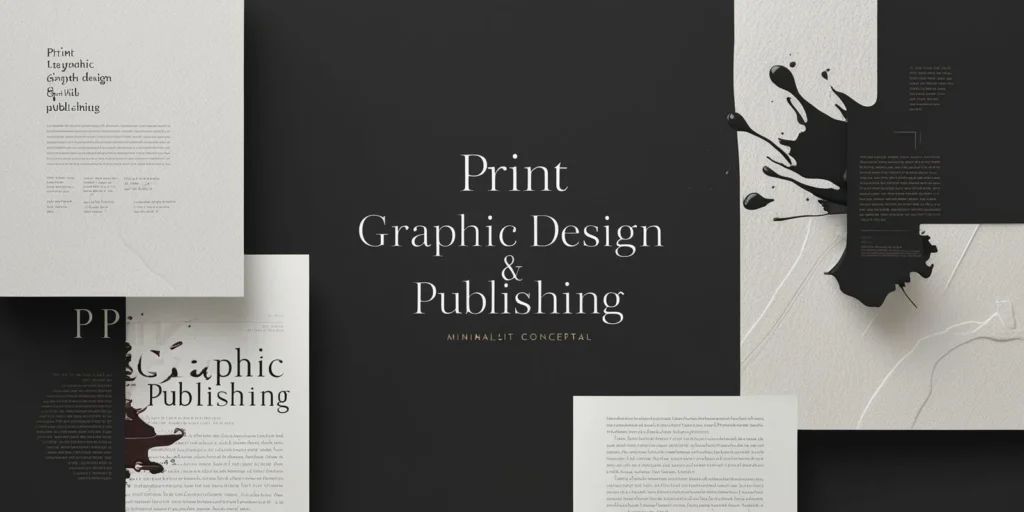
Print graphic design includes works that are produced physically on paper or other materials. In this section, we refer to the technical and artistic points related to design for print to achieve a professional and high-quality printed output:
- Resolution and Color Space: For high-quality printing, images must have a minimum resolution of 300 DPI to prevent visible pixels in the final print. The color space in print design is usually CMYK; colors must be defined based on this combination. Sometimes, for special prints, Pantone systems are used for more accurate color reproduction. Paying attention to color spaces is important because what you see on a screen may appear slightly different in print. Therefore, professional designers usually review print previews after digital design and make necessary adjustments.
- Bleed and Safe Margin: In print design, attention must be paid to the bleed area; images that reach the edge must extend beyond the final dimensions to avoid white edges after trimming. Typically, 3 to 5 millimeters of extra space is allocated for bleeding. Also, determining a safe margin within the final boundaries is essential to ensure that text or important elements are not lost during cutting. Adhering to these standards is especially important in book cover, flyer, and business card design. For example, if a logo or contact number is placed too close to the edge and no safe margin is set, it might get cut off during trimming.
- Layout and Use of Grid: Tools like professional layout software offer capabilities for arranging text and images in multi-page documents. Designers can use grids to align columns and frames consistently. Working with text styles speeds up the process. For instance, in magazine design, a three-column layout for long texts and a full-width image for the page title may be used; this order ensures visual coherence and ease of reading. Additionally, fine-tuning column spacing and aligning elements make the design appear more organized and professional.
- Packaging Design: Print graphic design also includes product packaging. Here, precise attention to box or label dimensions is necessary, and folding and cutting lines must be drawn in the software. Key information like product name, brand, and technical details should be placed appropriately and in a readable font. Moreover, considering the printing process is crucial; for example, the choice of coating can affect the final appearance of the product. Packaging graphics should convey the product’s concept at a glance while aligning with the overall brand identity.
- Choice of Print Material: The type of paper or printing material greatly affects the final result. Each material gives a different look to the design; for example, glossy paper enhances the brightness of colored images, while matte paper gives a more formal and serious look to text. In luxury packaging, special textures or foil colors may be used. Print graphic design should consider the final material to ensure design and material are in harmony.
- Paper Size: Familiarity with standard paper sizes such as A4, A5, and larger formats is essential for a designer. Before starting, the appropriate size must be chosen and the design layout prepared accordingly. For example, a business card is usually about 9×5 cm, whereas movie posters are much larger and require a different design approach. Choosing the wrong paper size during the design phase can lead to printing issues and wasted time and resources.
- Mockups and Previews: Before the final print, it’s best to use 3D mockups or test prints to check the proportion, color, and typography. For book or magazine design, getting a sample and thoroughly proofreading the content is important. Using real models also helps visualize how the final design will look on the actual product, allowing for necessary corrections. This helps fix potential issues before mass production.
By following these technical and artistic principles in print design, one can ensure that the final printed output maintains the desired appeal and quality. Especially in major printing projects, careful attention to these details is essential.
Trends and the Future of Graphic Design
The world of graphic design, like other fields of technology and art, is constantly evolving. New trends and technological advancements influence design styles and tools each year. Below are some key trends and future outlooks in the field of graphic design:
- Artificial Intelligence: AI-powered tools for automated graphic generation are booming. While tools like these are increasingly used to generate initial ideas or accelerate image creation, human creativity and the role of the designer remain essential. Today, designers can use tools like Midjourney and DALL·E to quickly create visual concepts and then refine them into final designs. However, this technology also raises ethical and legal questions around ownership. Overall, the integration of AI in graphic design is expected to grow, but human creativity will continue to be the defining element of originality and value.
- 3D Graphics and Immersive Design: The use of 3D design in motion graphics, virtual reality (VR), and augmented reality (AR) is on the rise. Interactive experiences in exhibitions and online stores, such as 3D product models, increase user engagement. Tools like Blender, Cinema 4D, and game engines like Unity and Unreal Engine enable designers to create realistic 3D scenes and dynamic animations. AR applications, such as Instagram filters or IKEA’s virtual furniture previews, demonstrate the growing presence of graphic design in the virtual world. These trends provide new user experiences that blend physical and digital realities.
- Sustainable and Eco-Friendly Design: With increasing environmental awareness, sustainability in graphic design has gained more attention. For example, in packaging design, using recyclable materials and minimizing waste are prioritized. Some designers also opt for eco-friendly inks and colors. This trend, known as “green design,” emphasizes that design is not just about aesthetics but also about social and environmental responsibility. Brands are striving to communicate their positive environmental messages through sustainable design, responding to growing consumer sensitivity toward ecological issues.
- Minimalism and Emerging Styles: The enduring appeal of minimalism remains strong, characterized by ample white space and simple typography. Additionally, styles like Google’s Material Design, with its clear layering and shadows, are popular in UI design. Other modern trends, such as neumorphism and glassmorphism, aim to create visually engaging, tactile interfaces. Retro and vaporwave aesthetics, inspired by the ’80s and ’90s with neon colors and nostalgic elements, are also gaining popularity among younger audiences. These styles combine modernity with a touch of nostalgia.
- Increasing Interactivity: Interfaces and content are becoming more interactive and multimedia-rich. Single-page websites with animated transitions, web-based games, and apps featuring audio and video content create unique user experiences. Design for voice interfaces and wearable devices is also on the rise. For example, visual interface design for AR glasses or smartwatches presents new challenges for designers. In summary, the future of graphic design lies in merging various technologies and media to create multisensory and interactive experiences.
- Personalized Visual Experiences: One of the emerging trends in digital design is the personalization of content and graphics. Brands and designers use user data analytics and AI to deliver tailored content that matches individual preferences and behavior. For instance, some platforms automatically adjust page color schemes and fonts based on user preferences or serve ads that align with their interests. This trend indicates that the future of graphic design and advertising will involve an even closer relationship between humans and machines.
Considering these trends, graphic designers must stay up to date and continually learn new tools and draw inspiration from emerging styles to create works that are both visually appealing and relevant to contemporary needs.
Final Summary
In conclusion, graphic design is a blend of art, technology, and communication strategies, where creativity meets scientific principles in every aspect. Understanding the history and fundamental concepts, mastering aesthetics, typography, and color theory, as well as being proficient in various software tools and techniques such as logo design, UI design, and advertising, are key pillars of a successful graphic designer. The application of these skills in print, digital, and multimedia projects offers a vast range of creative and professional opportunities. It is essential for designers to stay updated and continuously enhance their skills by following emerging trends. Graphic design also requires problem-solving thinking—understanding needs and challenges first, then crafting a visual solution with creativity and skill. A graphic designer bridges art and business, conveying messages in the most compelling visual form. Graphic design is a lifelong learning process, and real-world project experience is one of its greatest teachers. With a solid understanding of the topics in this article, we hope you take meaningful steps toward creativity and skill enhancement, and find success in the world of graphic design.
Frequently Asked Questions
Q: What is graphic design and what are its applications?
A: Graphic design is an art that uses images, color, typography, and layout to convey messages. Designers use artistic principles and technology to present ideas visually. Its applications are broad, ranging from advertising and branding to web design, apps, product packaging, social media content, and print publications.
Q: How can one become a professional graphic designer?
A: To become a professional graphic designer, continuous learning and practical experience are essential. Start by learning basic design principles and getting familiar with key software like Adobe Photoshop and Illustrator. Strengthen your skills by working on real projects and building a portfolio. Participating in specialized courses, reading design books, and following current trends also help improve your work and market understanding. In addition to technical skills, creativity and awareness of art styles set a designer apart.
Q: What are the most important graphic design software programs?
A: Depending on the project type, designers use different software. Adobe Photoshop is used for photo editing and composition. Adobe Illustrator and CorelDRAW are popular for vector design and logos. Adobe InDesign or Affinity Publisher are used for book, magazine, and catalog layouts. For UI design, tools like Figma and Adobe XD are widely used. There are also free and open-source tools like GIMP and Inkscape suitable for beginners or simple tasks. Choosing the right software depends on project needs and the designer’s style.
Q: What principles should be followed in logo design?
A: A successful logo should be simple, unique, and memorable. It must clearly convey the brand’s identity and concept. Key principles include using simple geometric shapes, legible fonts, and colors that match the brand’s personality. A logo should be scalable and recognizable even in one color. For example, many famous logos remain effective in black-and-white versions. Understanding the target audience, using relevant symbols, and testing the logo in various conditions are also crucial.
Q: Why are typography and color theory important in graphic design?
A: Typography and color theory are crucial in graphic design because they strongly impact visual appeal and emotional communication. Choosing the right font and adjusting spacing improves readability and attractiveness. For instance, appropriate font choice and line spacing enhance text clarity. Meanwhile, colors convey specific emotions—blue evokes calm and trust, while red signifies energy and excitement. Smart font and color combinations make designs not only beautiful but also meaningful and cohesive. Typography and color shape the viewer’s visual and emotional perception of a design.